响应式设计
Using responsive utility variants to build adaptive user interfaces.
概述
Tailwind 中的每个工具类都可以按不同断点有条件地应用,这样不用离开 HTML 就能轻松构建复杂的响应式界面。
首先,确保已在文档的 <head> 中加入 viewport meta 标签:
<meta name="viewport" content="width=device-width, initial-scale=1.0" />然后,若要添加一个只在某个断点生效的工具类,只需在工具类前加上断点名称和 : 字符:
<!-- [!code word:md\:w-32] -->
<!-- [!code word:lg\:w-48] -->
<!-- Width of 16 by default, 32 on medium screens, and 48 on large screens -->
<img class="w-16 md:w-32 lg:w-48" src="..." />
默认有五个断点,灵感来自常见设备分辨率:
| 断点前缀 | 最小宽度 | CSS |
|---|---|---|
| `sm` | 40rem (640px) | `@media (width >= 40rem) { ... }` |
| `md` | 48rem (768px) | `@media (width >= 48rem) { ... }` |
| `lg` | 64rem (1024px) | `@media (width >= 64rem) { ... }` |
| `xl` | 80rem (1280px) | `@media (width >= 80rem) { ... }` |
| `2xl` | 96rem (1536px) | `@media (width >= 96rem) { ... }` |
这对框架中的每个工具类都有效,意味着你可以在给定断点改变几乎任何东西——甚至是字距或光标样式。
下面是一个简单的营销页组件示例:小屏使用堆叠布局,大屏使用并排布局:
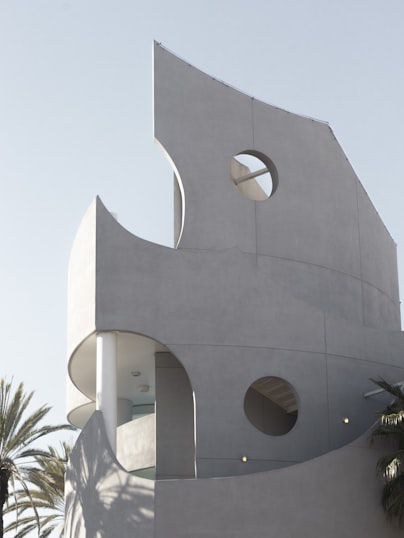
Looking to take your team away on a retreat to enjoy awesome food and take in some sunshine? We have a list of places to do just that.
<!-- [!code word:md\:max-w-2xl] -->
<div class="mx-auto max-w-md overflow-hidden rounded-xl bg-white shadow-md md:max-w-2xl">
  <!-- [!code word:md\:flex] -->
  <div class="md:flex">
    <!-- [!code word:md\:shrink-0] -->
    <div class="md:shrink-0">
      <!-- [!code word:md\:h-full] -->
      <!-- [!code word:md\:w-48] -->
      <img
        class="h-48 w-full object-cover md:h-full md:w-48"
        src="/img/building.jpg"
        alt="Modern building architecture"
      />
    </div>
    <div class="p-8">
      <div class="text-sm font-semibold tracking-wide text-indigo-500 uppercase">Company retreats</div>
      <a href="#" class="mt-1 block text-lg leading-tight font-medium text-black hover:underline">
        Incredible accommodation for your team
      </a>
      <p class="mt-2 text-gray-500">
        Looking to take your team away on a retreat to enjoy awesome food and take in some sunshine? We have a list of
        places to do just that.
      </p>
    </div>
  </div>
</div>
上面的示例是这样工作的:
- 默认情况下,外层
div是display: block,但加上md:flex后,在中等及以上屏幕会变成display: flex。 - 当父元素是 flex 容器时,我们希望图片永不收缩,因此加了
md:shrink-0,在中等及以上屏幕防止收缩。理论上也可以只用shrink-0,因为它在小屏上不会有任何效果;但既然它只在md屏幕上有意义,最好在类名里把这一点说清楚。 - 小屏上图片默认自动占满宽度。中等及以上屏幕,我们用
md:h-full md:w-48把宽度限制为固定尺寸,并让图片占满高度。
这个例子里只用了一个断点,但你也可以用 sm、lg、xl 或 2xl 响应式前缀,在其他尺寸轻松自定义这个组件。
移动优先
Tailwind 使用移动优先的断点系统,类似于你在 Bootstrap 等其他框架中可能习惯的做法。
这意味着不带前缀的工具类(如 uppercase)在所有屏幕尺寸上都生效,而带前缀的工具类(如 md:uppercase)只在指定断点及以上生效。
针对移动屏幕
这种方法最常让人意外的地方是:要为移动端设置样式,需要使用不带前缀的工具类,而不是带 sm: 前缀的版本。不要把 sm: 理解成「在小屏幕上」,而应理解成「在 small 断点处」。
DANGER
不要用 sm: 来针对移动设备
<!-- This will only center text on screens 640px and wider, not on small screens -->
<div class="sm:text-center"></div>
TIP
用不带前缀的工具类针对移动端,并在更大断点覆盖它们
<!-- This will center text on mobile, and left align it on screens 640px and wider -->
<div class="text-center sm:text-left"></div>
因此,通常最好先实现设计的移动端布局,再叠加适合 sm 屏幕的改动,然后是 md 屏幕,以此类推。
针对某个断点范围
默认情况下,md:flex 这类规则应用的样式会在该断点生效,并在更大的断点继续生效。
如果希望工具类仅在某个断点范围处于活动时生效,把 md 这类响应式变体和 max-* 变体叠在一起,把样式限制在特定范围内:
<div class="md:max-xl:flex">
  <!-- ... -->
</div>
Tailwind 会为每个断点生成对应的 max-* 变体,因此开箱即用的变体如下:
| 变体 | 媒体查询 |
|---|---|
| `max-sm` | `@media (width < 40rem) { ... }` |
| `max-md` | `@media (width < 48rem) { ... }` |
| `max-lg` | `@media (width < 64rem) { ... }` |
| `max-xl` | `@media (width < 80rem) { ... }` |
| `max-2xl` | `@media (width < 96rem) { ... }` |
针对单个断点
要针对单个断点,把 md 这类响应式变体和下一个断点的 max-* 变体叠在一起,锁定该断点的范围:
<div class="md:max-lg:flex">
  <!-- ... -->
</div>更多内容见针对某个断点范围。
使用自定义断点
自定义主题
用 --breakpoint-* 主题变量自定义断点:
@import "tailwindcss";

@theme {
  --breakpoint-xs: 30rem;
  --breakpoint-2xl: 100rem;
  --breakpoint-3xl: 120rem;
}
这会把 2xl 断点从默认的 96rem 改成 100rem,并创建可在标记中使用的新 xs 和 3xl 断点:
<!-- [!code word:xs\:grid-cols-2] -->
<!-- [!code word:3xl\:grid-cols-6] -->
<!-- prettier-ignore -->
<div class="grid xs:grid-cols-2 3xl:grid-cols-6">
  <!-- ... -->
</div>
注意:定义断点时务必使用相同单位,否则生成的工具类可能按意外顺序排序,导致断点类以意外方式互相覆盖。
Tailwind 默认断点使用 rem,因此如果要在默认断点上追加新断点,请同样使用 rem。
更多自定义主题的内容,见主题文档。
移除默认断点
要移除某个默认断点,把它的值重置为 initial 关键字:
@import "tailwindcss";

@theme {
  --breakpoint-2xl: initial;
}
也可以用 --breakpoint-*: initial 重置所有默认断点,然后从头定义全部断点:
@import "tailwindcss";

@theme {
  --breakpoint-*: initial;
  --breakpoint-tablet: 40rem;
  --breakpoint-laptop: 64rem;
  --breakpoint-desktop: 80rem;
}更多移除默认主题值的内容,见主题文档。
使用任意值
如果需要一次性断点、不适合放进主题,用 min 或 max 变体,按任意值即时生成自定义断点。
<!-- [!code word:min-\[320px\]\:text-center] -->
<!-- [!code word:max-\[600px\]\:bg-sky-300] -->
<div class="max-[600px]:bg-sky-300 min-[320px]:text-center">
  <!-- ... -->
</div>更多任意值支持的内容,见任意值文档。
容器查询
什么是容器查询?
容器查询是现代 CSS 特性,让你根据父元素尺寸而不是整个视口尺寸来设置样式。这样做出的组件更便携、更可复用,因为它们可以根据该组件实际可用空间来变化。
基本示例
用 @container 类把元素标记为 inline-size 容器,然后用 @sm、@md 这类变体根据容器尺寸为子元素设置样式:
<!-- [!code word:@container] -->
<!-- [!code word:@md\:flex-row] -->
<div class="@container">
  <div class="flex flex-col @md:flex-row">
    <!-- ... -->
  </div>
</div>
和断点变体一样,Tailwind CSS 中的容器查询也是移动优先的,会在目标容器尺寸及以上生效。
最大宽度容器查询
用 @max-sm、@max-md 这类变体,在低于特定容器尺寸时应用样式:
<!-- [!code word:@max-md\:flex-col] -->
<div class="@container">
  <div class="flex flex-row @max-md:flex-col">
    <!-- ... -->
  </div>
</div>
容器查询范围
把普通容器查询变体和最大宽度容器查询变体叠在一起,以针对特定范围:
<!-- [!code word:@sm\:@max-md\:flex-col] -->
<div class="@container">
  <div class="flex flex-row @sm:@max-md:flex-col">
    <!-- ... -->
  </div>
</div>
具名容器
对于使用多个嵌套容器的复杂设计,可以用 @container/{name} 给容器命名,再用 @sm/{name}、@md/{name} 这类变体针对特定容器:
<!-- [!code word:@container/main] -->
<!-- [!code word:@sm/main\:flex-col] -->
<div class="@container/main">
  <!-- ... -->
  <div class="flex flex-row @sm/main:flex-col">
    <!-- ... -->
  </div>
</div>
这样就可以根据较远容器的尺寸来设置样式,而不只是最近的容器。
使用尺寸容器
当你需要使用依赖块轴尺寸的容器查询长度单位(如 cqb)时,用 @container-size 把元素标记为 size 容器,而不是 inline-size 容器:
<!-- [!code word:@container-size] -->
<!-- [!code word:h-\[50cqb\]] -->
<div class="@container-size">
  <div class="h-[50cqb]">
    <!-- ... -->
  </div>
</div>
也可以用 @container-size/{name} 给 size 容器命名。
使用自定义容器尺寸
用 --container-* 主题变量自定义容器尺寸:
@import "tailwindcss";

@theme {
  --container-8xl: 96rem;
}
这会添加一个可在标记中使用的新 8xl 容器查询变体:
<!-- [!code word:@8xl\:flex-row] -->
<div class="@container">
  <!-- prettier-ignore -->
  <div class="flex flex-col @8xl:flex-row">
    <!-- ... -->
  </div>
</div>更多自定义主题的内容,见主题文档。
使用任意值
对于不想加入主题的一次性容器查询尺寸,使用 @min-[475px]、@max-[960px] 这类变体:
<!-- [!code word:@min-\[475px\]\:flex-row] -->
<div class="@container">
  <div class="flex flex-col @min-[475px]:flex-row">
    <!-- ... -->
  </div>
</div>
使用容器查询单位
把 cqw、cqi 这类容器查询长度单位作为其他工具类中的任意值,以引用容器尺寸:
<!-- [!code word:w-\[50cqw\]] -->
<div class="@container">
  <div class="w-[50cqw]">
    <!-- ... -->
  </div>
</div>
对于需要不止内联尺寸的单位(如 cqb 和 cqh),使用 @container-size 以提供容器的完整尺寸。
容器尺寸速查
默认情况下,Tailwind 包含从 16rem (256px) 到 80rem (1280px) 的容器尺寸:
| 变体 | 最小宽度 | CSS |
|---|---|---|
| `@3xs` | 16rem (256px) | `@container (width >= 16rem) { … }` |
| `@2xs` | 18rem (288px) | `@container (width >= 18rem) { … }` |
| `@xs` | 20rem (320px) | `@container (width >= 20rem) { … }` |
| `@sm` | 24rem (384px) | `@container (width >= 24rem) { … }` |
| `@md` | 28rem (448px) | `@container (width >= 28rem) { … }` |
| `@lg` | 32rem (512px) | `@container (width >= 32rem) { … }` |
| `@xl` | 36rem (576px) | `@container (width >= 36rem) { … }` |
| `@2xl` | 42rem (672px) | `@container (width >= 42rem) { … }` |
| `@3xl` | 48rem (768px) | `@container (width >= 48rem) { … }` |
| `@4xl` | 56rem (896px) | `@container (width >= 56rem) { … }` |
| `@5xl` | 64rem (1024px) | `@container (width >= 64rem) { … }` |
| `@6xl` | 72rem (1152px) | `@container (width >= 72rem) { … }` |
| `@7xl` | 80rem (1280px) | `@container (width >= 80rem) { … }` |